The Power of Colour: How Choosing the Right Colour Scheme Can Transform Your Workspace
Discover the Impact of Colour on Emotions, Perception, Productivity, and Creativity in the Workplace.
Most often when we find ourselves in a working space, you’ll get these impressions:


I don’t know what that does to you, but to me it evokes emotions and reflections like dullness, long uninspiring meetings, stress, stuffiness,.. even headaches.
Without always being aware of our surroundings, our environment has a big impact on our well-being. When we move into our new house or apartment we want to make it as cosy as possible. Good lightning, nice furniture, great colour scheme,..
When having an office, this becomes less easy to do, because we have to take in account multiple tastes. And there’s no arguing about taste.
But we do spend most of our times in a working environment, so why not make the best out of these spaces and not only have the cosy, protective atmosphere in our private homes?
In this blogpost I’ll talk about the effect of colour to our lives. It’s such an easy improvement, all you need is some paint or wallpaper!
Colour and Emotions
Through many thousands of years of evolution we have found ourselves attracted to certain colours in certain situations without really knowing where this attraction is coming from. By looking at colour, our ancestors learned that some food, predators or other signals of any kind could be toxic and deathly.
Red and blue have opposite wavelengths in our visible spectrum of white light. Red wavelength reaches the eye faster than blue. It is for this reason that red is used in situations that require rapid reaction of our brain (emergency, urgency…).1
Colors in the red area of the color spectrum are known as warm colors and include red, orange, and yellow. These warm colors evoke emotions ranging from feelings of warmth and comfort to feelings of anger and hostility.
Colors on the blue side of the spectrum are known as cool colors and include blue, purple, and green. These colors are often described as calm, but can also call to mind feelings of sadness or indifference.2


Watch this TED talk where Ingrid Fetell Lee talks about the concept of joy and how important it is to incorporate this into our daily lives. Joy is often seen as something “soft”, something we don’t necessarily need. But when talking to people she noticed how important it is and she started asking what things in life brought those people joy.
She was wondering if she could find patterns in the things make us feel joyful. And she did. She found 5 categories: round things, pops of bright colour, symmetrical shapes, abundance and multiplicity and a feeling of lightness or elevation.
Colour and Perception


Colour can also influence our perception of space. Dark colors can make a space feel smaller, while light colors can make it feel more open and airy. Choosing the right color scheme can make a space feel more welcoming and comfortable, which can improve our well-being and productivity.
The way colour is chosen in a space and which colour, makes a space more open and airy. That is to say, not only dark colours can have that effect. The colour red can be really nice and productive, but too much of it can make the space again very dark and stuffy.
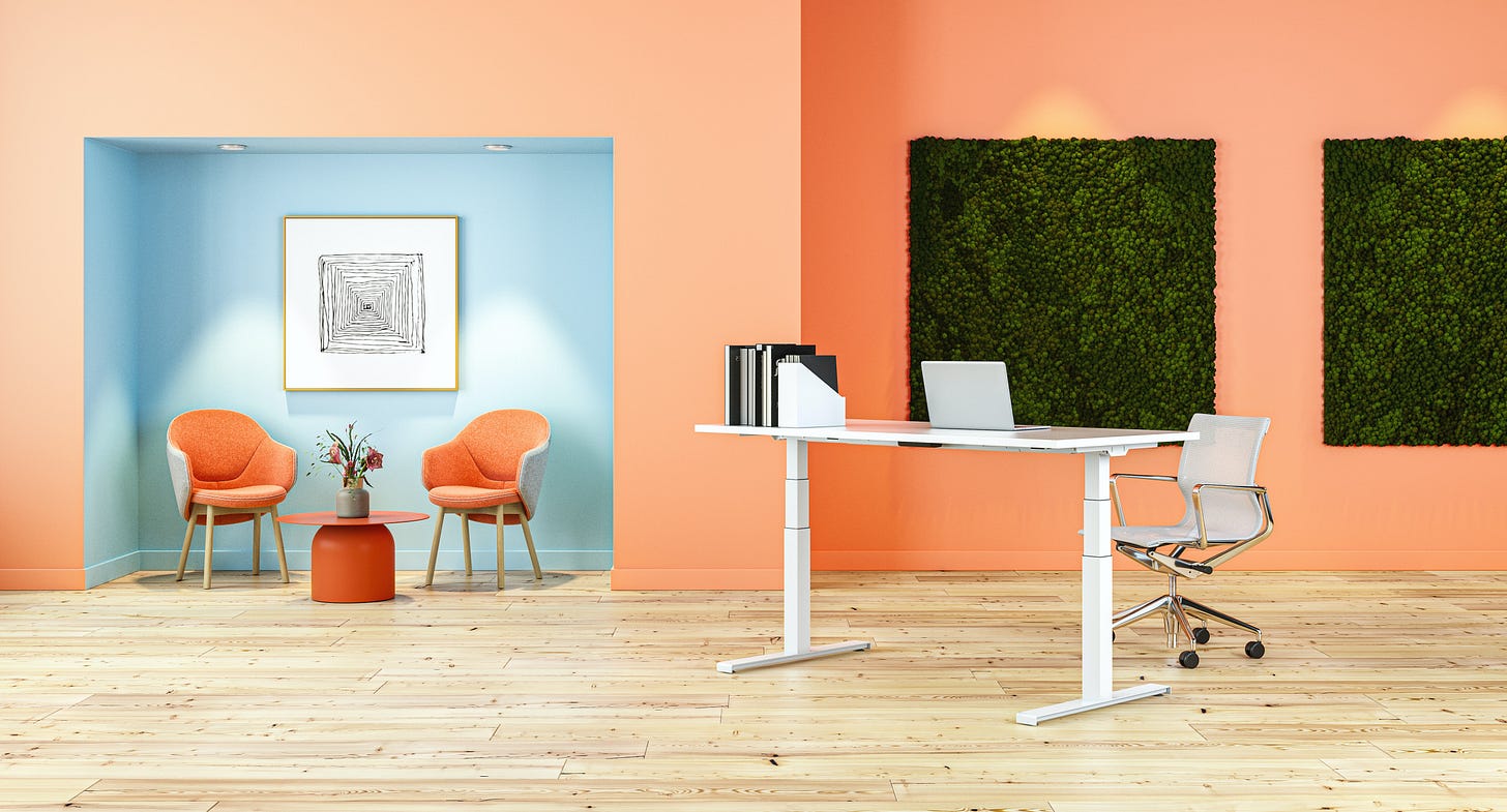
Choosing the right walls, for example just right where the sunlight hits, or ceilings can enlarge a space or make it tiny. In the images above you can see that by just adding colour, the whole space and perception of the space can change.
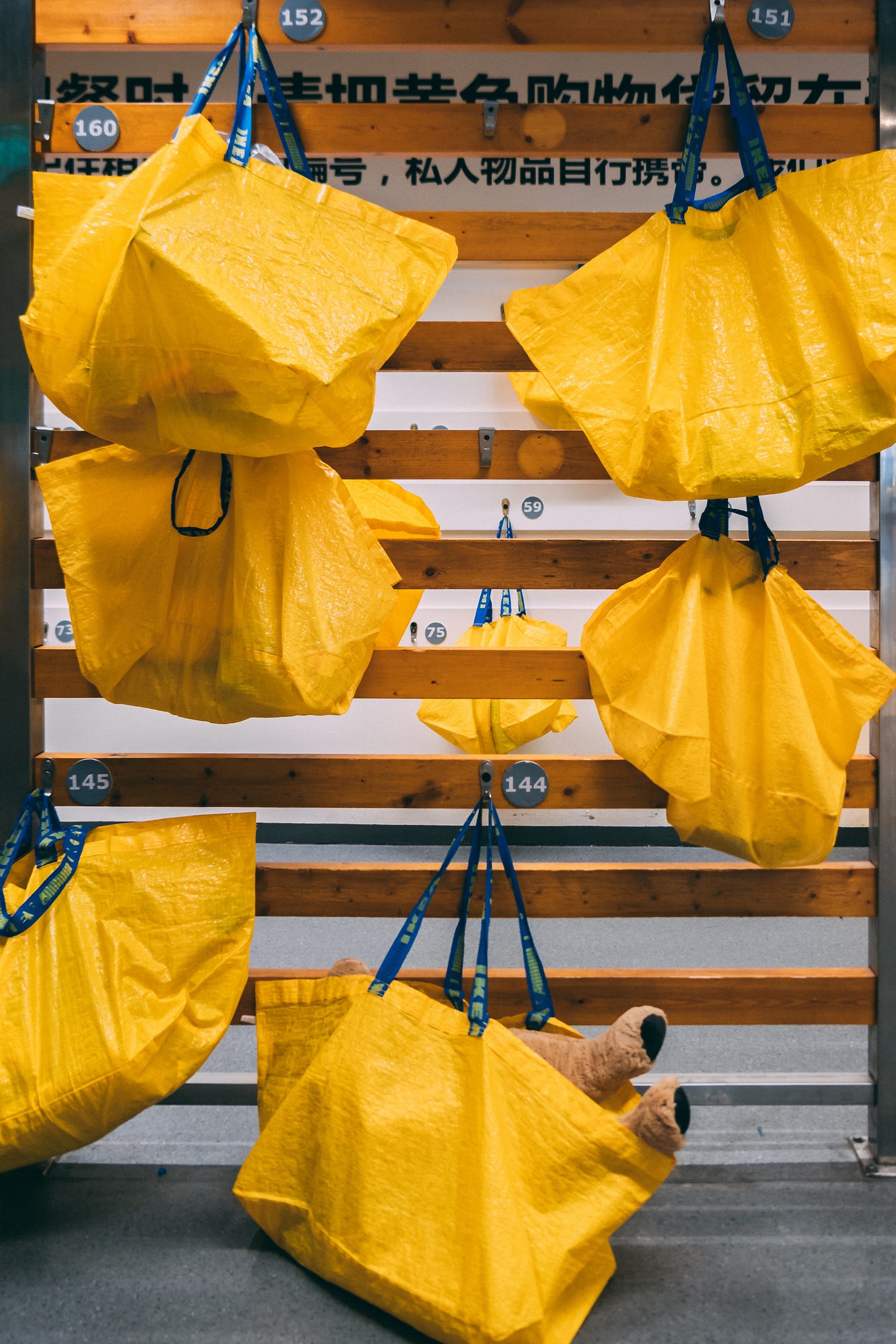
The same goes for attracting spaces. Some spaces need to be seen in a blink of an eye, thinking of safety but also facilities like the picture shows below. The example which is shown below is the perfect example of catching someone’s attention. By colouring every surface bright yellow and adding light, the whole space lights up.
Quite handy when it’s the first time for you in that building and you need to go. If you need to go, you need to go.
Colour and Branding
Colour can also play an essential role in branding and marketing. Companies often use specific colors in their logos and branding materials to convey a certain message or image. For example, red is often associated with energy, passion, and excitement, which is why many fast-food chains use this color in their branding.
It is important to incorporate your branding colours into your working space, without overdoing it. Always choose your colour wisely and don’t combine too many colours, even though it might be in your branding.
Colour and Productivity
Research suggests that the right colour scheme can improve productivity in the workplace. For example, blue can help employees focus and stay calm, while green can reduce eye strain and fatigue. Using the right colors in a workspace can create a more comfortable and productive environment.
While the presence of color in your environment can impact the workplace, so does the lack of color! In fact, working in offices with a neutral chromatic atmosphere, like gray, will increase the risk of burnout by 15% and decrease productivity by 12%.3
Colour and Creativity
Colour can also spark creativity and innovation. Using bright colors and bold patterns in a design or workspace can encourage out-of-the-box thinking and idea generation.
Overall, red is associated with leadership, power, and superiority and can improve productivity in the workplace, and blue is associate with intelligence and promotes honesty and creativity in the workplace.4


Conclusion
Colour affects our emotions, perception, productivity, and creativity. It is therefore essential to do more research in your own company to what effect colour will have specific to your situation. It is important to create a comfortable and welcoming environment in our workplaces, just as we do in our homes. Incorporating specific colors can influence our perception of space, enhance our well-being and productivity, and even spark creativity.
If this doesn’t convince to you change your colour scheme in your office, I don’t know what will.
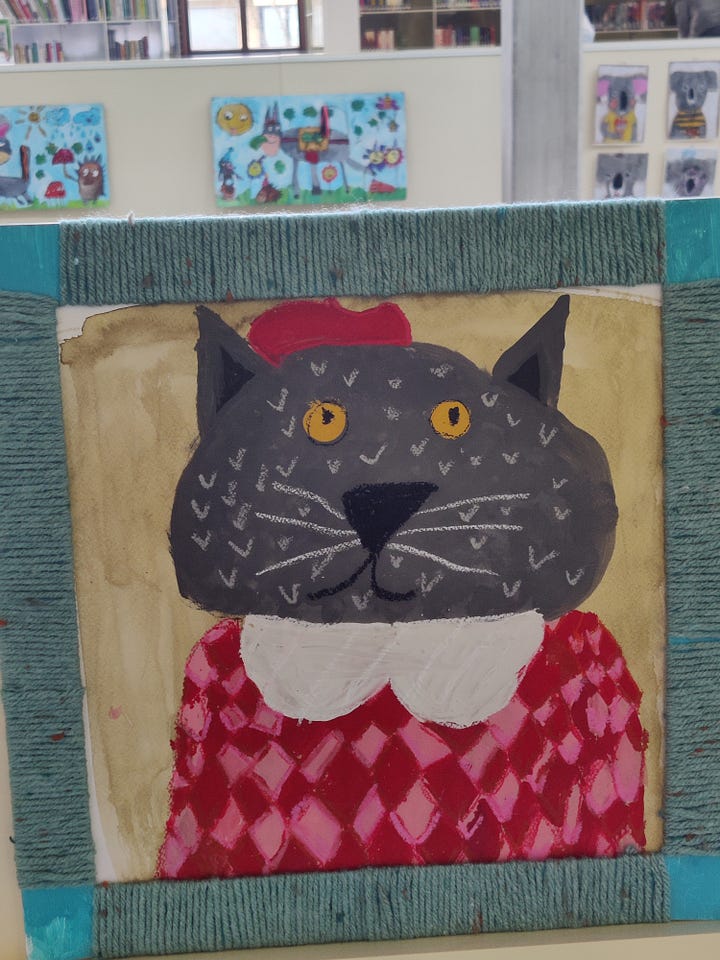
To end this blogpost on a even more fun note: the pictures down below are four portraits I found in the local library. This lifted up my spirits and I found myself chuckling seeing those adorable pictures made by children.
Hope you find it as amusing as me.
Thanks for reading!




This is so interesting and also lovely how you wrote it Katrien! If more people are getting awareness on which colors they use we would have a nicer world! And advantages you mentioned are really making a difference!